@bitacovir said:
those are really cool, but also seem a bit generic to me. Does that matter? I don't know. love the text, not so sure about the snake sleeping beside a lamppost.
@bitacovir said:
those are really cool, but also seem a bit generic to me. Does that matter? I don't know. love the text, not so sure about the snake sleeping beside a lamppost.
@duncan said:
not so sure about the snake sleeping beside a lamppost.
JAJAJAJA. it is a b, a bbbbbb... :)
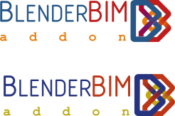
Anyway... here another option with design of @baswein

@bitacovir I like your layout.
Changed the font to one that I think works a little better with logo. 2 different color schemes.
And here is a larger version
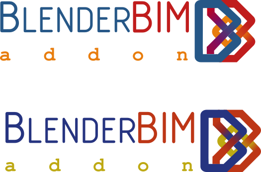
And a try at a Favicon

@baswein said:
@bitacovir I like your layout.
Changed the font to one that I think works a little better with logo. 2 different color schemes.
It is only a personal preference, but I would prefer a font with a strong character. A fancy character may work... whit same height, color and font, to blend both names and create a single word and sound: BLENDERBIM, blenderbim
You can explore more font types in this website, even writing the text to compare: https://www.fontspace.com/popular/fonts?p=18
I too have a personal preference for a font size that matches the logo height, as well as a single typeface, not two for consistency.
Hi guys,
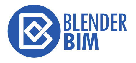
I just wanted to add some ideais. I really liked the simplified version that @baswein posted earlier so I played a little bit with that idea. The file is attached:

 64 x 64
 16x16
16x16
@bruno_perdigao said:
I like your version a lot. Inspire me to use the symbol as type font template for the rest of the text, because still I think a strong font is better.

@bruno_perdigao very cool! Just a note that from an agreement with Ton, founder of Blender, we must have the full "BlenderBIM Add-on" in the name.
@bruno_perdigao said:
Hi guys,
I just wanted to add some ideais. I really liked the simplified version that @baswein posted earlier so I played a little bit with that idea........
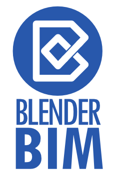
I like that simplified version as well. I had a quick go at your file. Here's my take:

Oops, just read the email exchange with Ton, re: the use of the name Blender, after posting. So yes, Add-on can be added to the name as per the agreement, but it does look like eventually, they will be reaching out more firmly to everyone to please stop using the name in their products / services, if Ton does not have the stomach for this just yet, someone else will, especially as they start exploring more funding options which might require tighter protection of the brand (which is all they have to sell by the way, so fair enough). I suggest while BlenderBim continues with the current arrangement for the time being for the convenience of building a community around it, it should be borne in mind that there would most likely be a need to rebrand in the near future.
Another take.....this time made in Blender.
A head's up that on July 25th, a month would have passed with no new entries, so after July the 25th, I'll collate them all into a vote, and then the one that is voted on the most can get tweaked (final colours, outlines / fills / font) for finalisation :)
A month has passed, so please respond to this thread with a vote on which logo you like the best. You are also free to add caveats, such as if you like the shape, but not the colour. We'll spend until the 21st of August voting, and then in the final week I will re-work the logo into an SVG with standardised branding colours and B&W version, and then will release it on the 28th of August. The reason is because BlenderBIM Add-on's 1 year birthday will be on the 29th of August :) and I think it'll be nice to have a logo prepared for it!
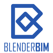
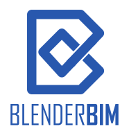
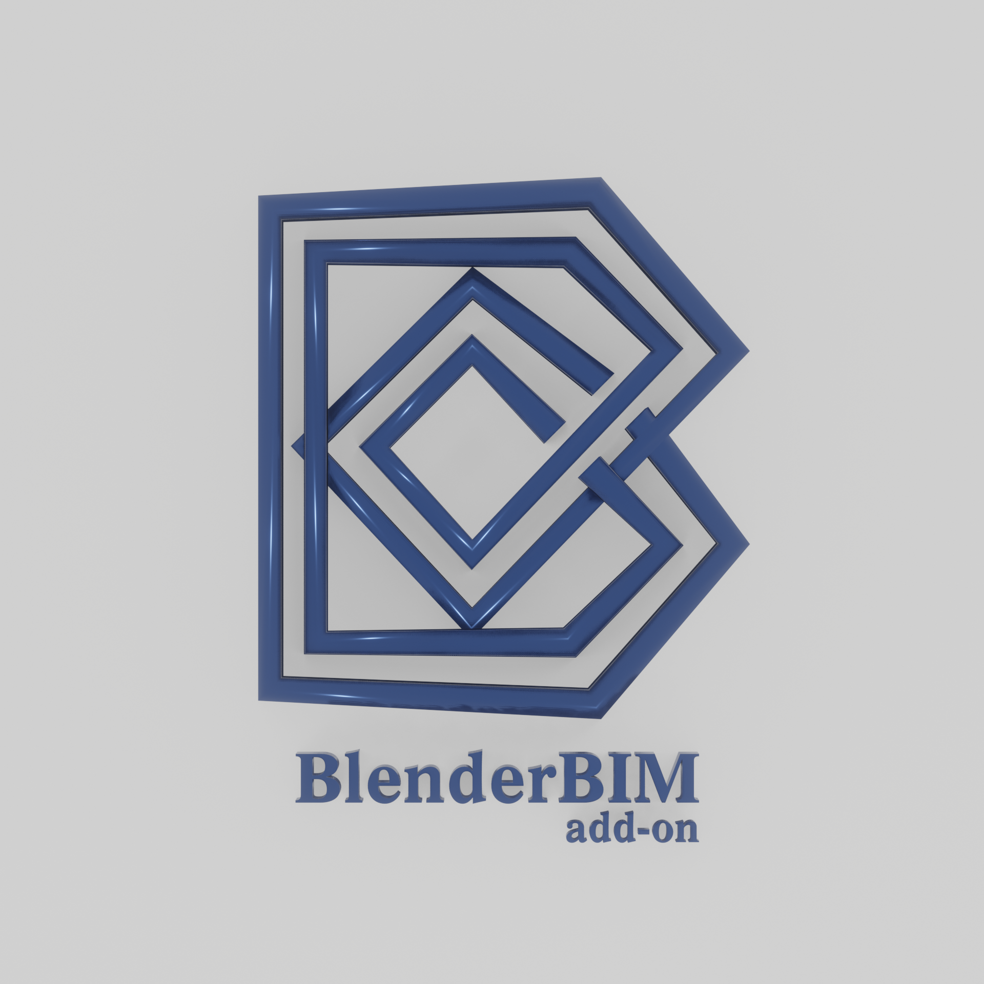
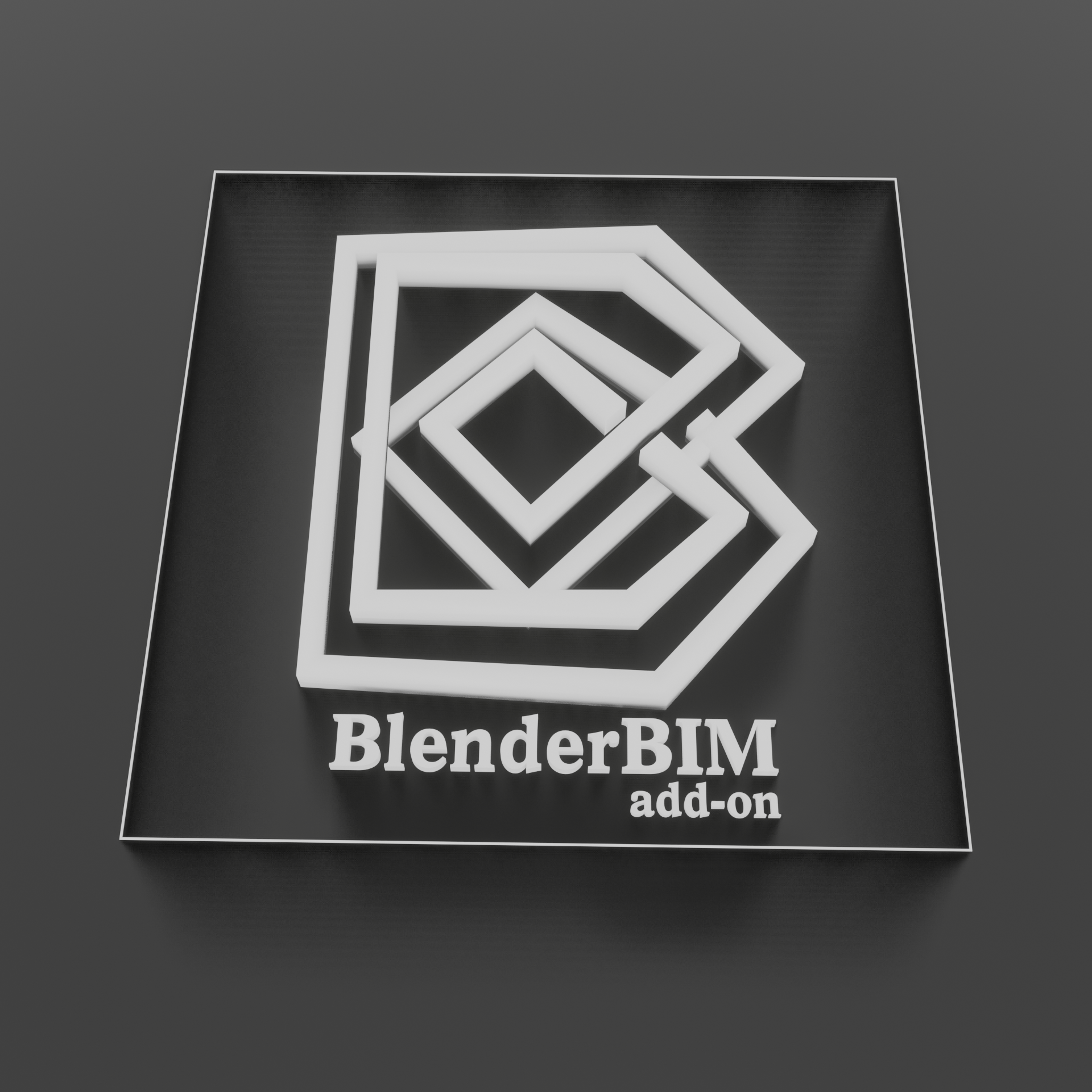
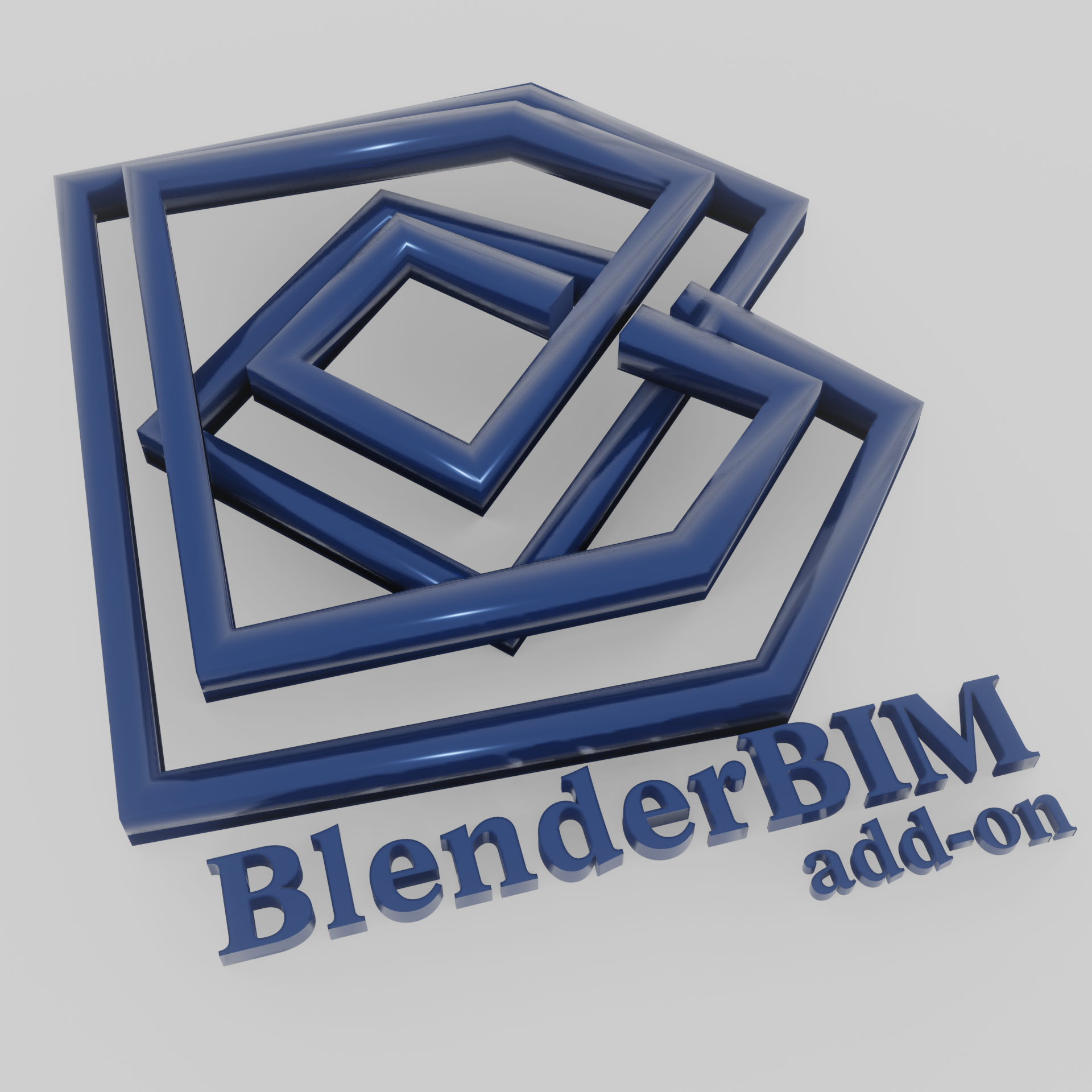
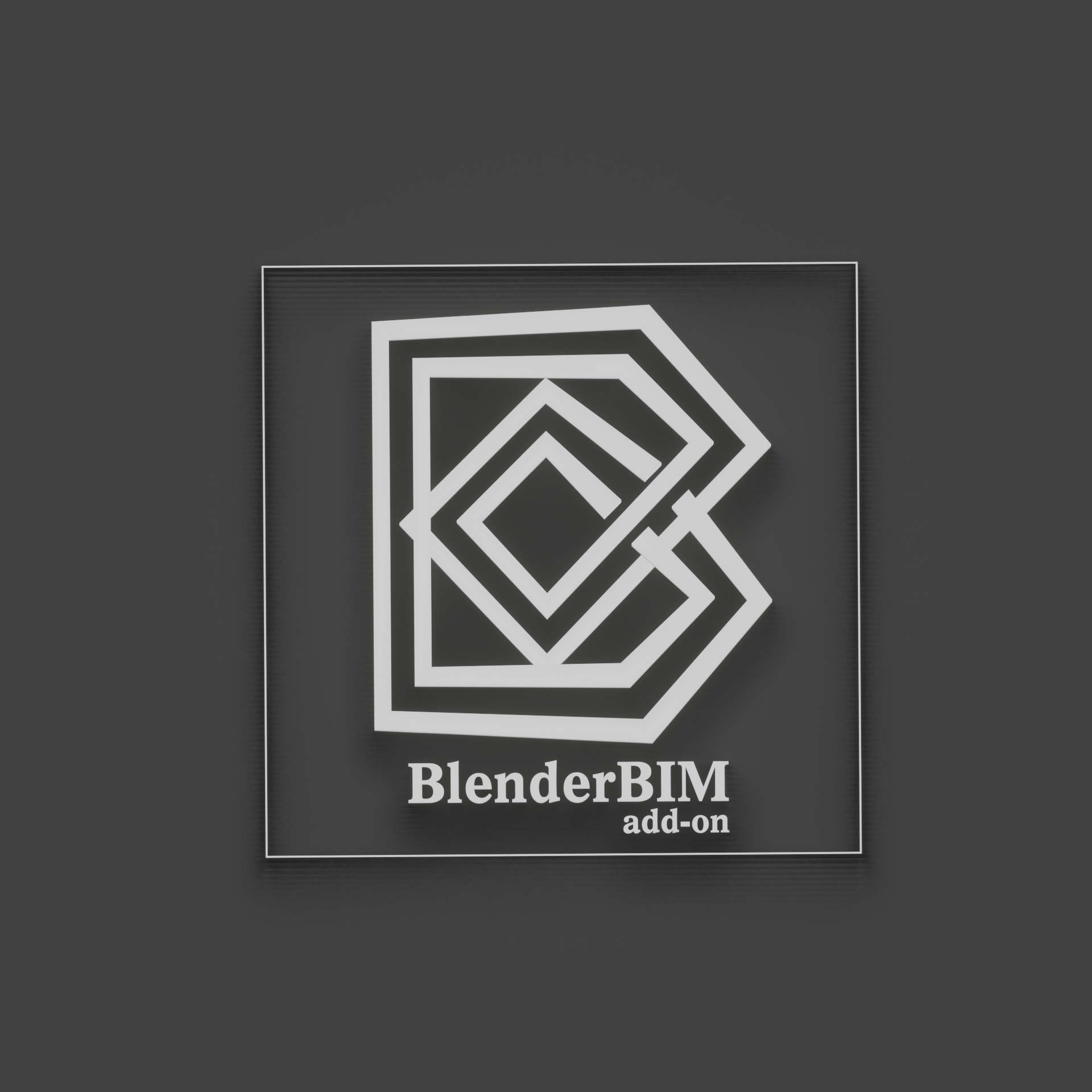
For my own vote, I vote for the shape C1 in this post. I like it because it's simple, so will work in many resolutions, will work in greyscale and black and white, it can be read as a "B" or "b" simultaneously for "Blender" + "BIM". It also has a visual similarity to the IfcOpenShell logo:

Although I like that shape, I am open to changing the colour to something that isn't the Blender orange and blue (to respect Ton's wishes) and will prefer to resemble the IfcOpenShell green / orange / yellow colours.
I am worried about choosing the logo proposals of the two B's weaving together, since both in shape and colour it is very similar to the IFC logo, and that might get them a little pissed :) Although visually I do like it.
@Moult you linked to "this post" but I'm not sure what you mean - you've linked to this post we're in. Do you mean the opening comment by @hzamani ?
@duncan yes - the first post. Sorry for the confusion.
I like @Moult 's ideia. C1 from @hzamani 's first post and the colors from IfcOpenShell.
My vote also would be C1. Agree with colour update also to distinguish from Blender's theme.
My second vote is @bitacovir s design above.
@DADA_universe said:
One of these two. Clean, not a lot of color, good contrast (think of the colorblind people when using more than 2 colors), simple.
@vocx said:
@DADA_universe said:
One of these two. Clean, not a lot of color, good contrast (think of the colorblind people when using more than 2 colors), simple.
Add my vote to the @DADA_universe proposal. Clean, simple, reminding of the ifc logo but different enough
@Moult something like this? The precise placement of the gradients would need a bit of fine tuning.
16x16

32x32

64x64

128x128

Edit:
Maybe with the gradient more like this:

I feel like it keeps the strength and simplicity of the design better without the gradient.


I also played around with a cylinder idea.

But in the end I like still like the simplicity of these
Fantastic! I also prefer without the gradient. Can we get a vote between those two options so we can finalise the design? (btw, the typeface needs to be confirmed, and the word "Add-on" needs to be in the title too)
Please vote here: https://framadate.org/uwDKVCfx1R9TfxFS
I'd like to finalise this the day after tomorrow.
It hard to follow where vote are going. There is many different versions. What about a poll with each logo which get at least one vote : https://framadate.org/
@Cyril sorry - vote here: https://framadate.org/uwDKVCfx1R9TfxFS
:)
@Cyril I think @Moult is suggesting there are only two candidates. Fine by me, I've got no dog in this fight. Although graphically I like the B it is tied to the name rather than the origins of BlenderBIM Add-on. I think in the long run the name might change ( I hope so ) but the ties to IfcOpenShell aren't going anywhere. So if we're voting I support the no-gradient version of C1.
Login or Register to reply.