OSArch Community

OSArch website design

  1. M

    @duncan cheers, I've merged the posts. Apologies for not keeping it in the right discussion.

    As people seem to think it's a step in the right direction, I've now copied it over to the main homepage. Feel free to continue hacking on it! I like the three words "Learn | Create | Contribute", I think they make sense. Please go for it!

    I have also upgraded Mediawiki to 1.35.0, which is the latest version. No doubt there will be some subtle improvements. One big improvement is that the page editor now contains buttons to help create the correct markup.

    1.35.0 also comes with a much nicer visual rich editor (@stephen_l) but unfortunately there seems to be a bug where it works for new pages, but breaks in a funky way if you want to edit an existing page created prior to v1.35.0 (@Cyril and I spent some time trying to track the bug down!). Other users are experiencing the same bug, so we'll just wait for it to be fixed before rolling it out.

    @ReD_CoDE that repo is for Github docs itself, not for users to create their own documentation, I think.
  2. R
  3. M

    @ReD_CoDE that issue seems to be about providing an API to the Github docs, not about making the software standalone so people can host their own docs.

  4. R

    @Moult it's exactly for providing a package for individuals

    The API, for instance GraphQL, is for managing data transformation through communication

    GitHub chose GraphQL instead of REST to do that

  5. M

    Inspired by @bitacovir's proposal, I'd like to standardise the "look and feel" of the Wiki, Community, and OSArch landing page. There are three aspects I see to this:

    1. A logo, repeated across all three sites

    2. A colourscheme, repeated across all three sites.

    3. A typeface, repeated across all three sites

    For the third, I have gone ahead and swapped it out to Open Sans for all headers, and Lato for all body text. They are both open source and battle-tested standards, suitable for text-heavy content such as wiki and forums. There is some work to be done to standardise font sizes, and I will slowly tweak this as time goes.

    Can I get some thoughts on the colourscheme? This colourscheme will be used to standardise background colours, text colours, link colours, button colours, across all pages. Doing this step is relatively easy and can do a lot for unification of the design. Do we want to continue with a light colour scheme, or do we want to swap to a dark theme?

    Here is the community's current scheme: https://coolors.co/ffffff-22252c-e14658-555555-888384

    Here is the wiki's current scheme: https://coolors.co/ffffff-555555-eaecf0-3366cc-8e36ae

    Things to consider:

    1. Links are extremely important in a Wiki. They should be clearly identifiable, with three distinct colours for regular links, visited links, and non-existant page links.

    2. Pages may have lots of graphics, including screenshots of applications. How does this work with the colour scheme?

    I would personally like to get the colourscheme and all fonts + font sizes finalised by the end of November. Then, we can document it on the Wiki and stick to it for all future branding exercises.

  6. J

    I like more the colour scheme of the community. And I am a fan of dark themes, I find them more relaxing for the eyes and also more sustainable from an energy consumption perspective

  7. J

    I would strongly suggest using a different layout for mobile devices, on my phone is the wiki homepage in the current format completely unreadable.

    @Moult @duncan

    Also, I have to admit I am not convinced this was a step in the right direction.

    1. The three topics are great, but splitting the main area vertically does not improve readability and takes away the impact of the three headlines, by the way the classical wiki layout already is a three column layout (left menu, main content, right menu) .

    2. Splitting the main area is kind of confusing, since the classical wiki layout is so ubiquitous so everyone is used to it.

    3. None of the other osarch wiki pages can use a format with the main area split into three columns.

    4. Maybe it's just me, but I subconsciously expect the welcome text on the white background under the headline and kind of skip the parts in the darker rectangles - I expect some additional info there, not the main content.

    I feel like this organization would be put to a much better use on the osarch main page, wiki is supposed to be clear and informative and boringly effective in communicating information, it is the home page which should be cool and playful. If we need a more cool looking wiki, I find for example the https://www.bimpedia.eu/ looks ok and the tiles scale much better to the different devices than a fixed number of columns.

  8. D

    @JanF has an important point on readability we need to make that just work. Columns as the wiki presents them on a narrow screen are not really acceptable. On a narrow screen it would be okay if they were three tabs or something, but there is not enough space for three columns. Maybe that can be fixed in the CSS but it's been years since I've played with CSS.

    Maybe it's time for a stripped down eye-candy version of what is notw the wiki front page (latest version with the three columns) for the osarch front page? We've got enough content to do it and we can probably control the formatting much better on the front page. What the backend CMS @Moult ? Depending on the system I'm sure someone has the time and skills to do it (besides you :-) )

  9. S

    Are there bootstrap or fundation templates available ? Such templates are likely to solve color scheme (user pref based) and mobile accessibility issues.

  10. M

    @JanF sorry, I didn't make it responsive as it was still just a mockup. I've now fixed it and made it responsive, so on small devices, it will revert to a single column layout.

    @stephen_l I have a personal gripe with bootstrap, but I've now loaded in the Skeleton grid, so if we do want responsive column layouts within the wiki anywhere, it is now possible.

    For comparison:

    1. Responsive 3 layout option: https://wiki.osarch.org/index.php?title=Home_of_OSArch (preferred by @duncan, @Cyril)

    2. Traditional layout option: https://wiki.osarch.org/index.php?title=User:Moult (preferred by @JanF)

    3. No preference (@stephen_l)

    Let me know which one prefer, and I'll update it :) (or, make your own proposal on your wiki User page! Everybody can contribute!)

    In the meantime... colour scheme preferences?

  11. C
  12. M

    I created some graphics to complement the three categories. The graphics embody what I personally believe should be part of the "identity" of OSArch. You'll notice they are relaxed, casual, napkin-sketchy style graphics, similar to how I created the globe icon (I personally do not distinguish between the natural and the built environment, so I see the world as representative of the built environment). I feel this graphic style helps embody the character of open source communities - it's the opposite of corporate, vetted, and pristine - it's quick and dirty, and has character like a human.

    I also hope to draw parallels between the quick idea-concept sketching that architects do when a design begins.

  13. S

    Have no strong preference, but to me responsive laout is a priority.

  14. D

    The new layout and little icons and all that stuff look freaking awesome. We're slowly getting there. Great that you had some time @Moult to look into it.

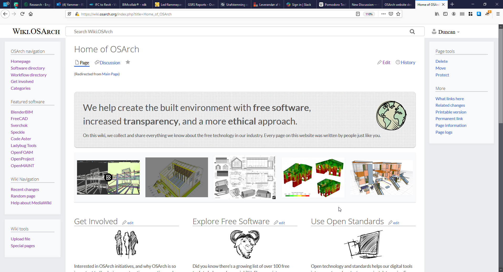
    I'm not keen on that top section. I think it takes up too much space. Here's a picture of what's on my screen for my laptop. Pretty much all the page content is hidden

    I think either the images or the banner or both need to go, but then something similar should be prominent on the osarch.org page. Compare for example the osgeo front page https://www.osgeo.org/ with the osgeo wiki https://wiki.osgeo.org/wiki/Main_Page

    I think that's the direction where @JanF and I hope we can go. In architecture terms, a great lobby front page where you get a feel for the place (osarch.org ) - and then the library behind (wiki.osarch.org ).

    I think we need a logo to focus our attention on color/style/font etc.

  15. J

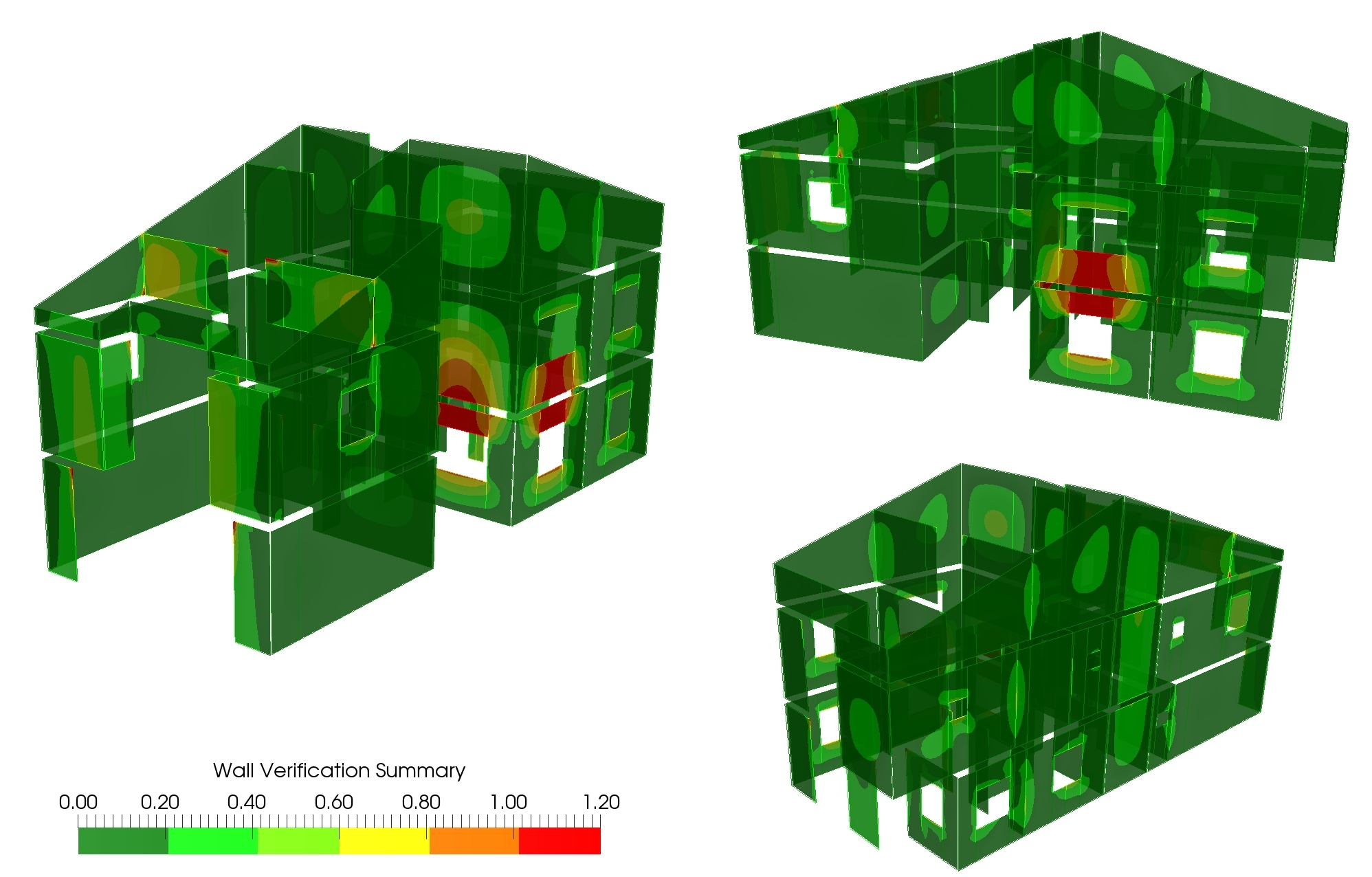
    Pretty much exactly what @duncan said. Sketches are perfect, the top section is not great. That red-swampy-green image from code_aster haunts my dreams.

    I also started thinking about a OSArch logo the other day and I'd like to put my draft of the homepage over the weekend together.

  16. M

    I've shuffled the apparently nightmare inducing gallery strip to the bottom :) Hopefully that's better.

  17. D
  18. J

    @JanF said:

    That red-swampy-green image from code_aster haunts my dreams.

    That made me laugh pretty hard although you do hurt my feelings for my creation :D :D

    What colors would you have preferred, I mean it is a verification map, green is good (verified) and red is bad, that's how we engineers reason :)

  19. M

    Maybe it needs to be all green? :)

  20. J

    there is the final version ;) it was part of a feasibility study. I will change it and perhaps make it clickable for a short description of the workflow or something like that in the next few days

  21. J

    Hahaha, didn't mean to hurt your feelings, all green is good of course, but I just meant something easier on the eyes, perhaps

    or

  1. Page 1
  2. 2
  3. 3
  4. 4

Login or Register to reply.