The GUI of any software should be as easy and intuitive as possible to the intended audience by default. It also should expose the underlying structure, but only if explicitly desired.
Yes, except that this isn't typically how things are done in the free software world. In the proprietary software world, often the sales and marketing is done first, and so that end goal, workflow, or UX (and sometimes even the UI) is designed first. So we might start with "We want the user to click the Wall Tool, then click a start and end point and a wall will appear".
In free software, often we'll ship a functional version first just so that the technical geeks can have it "working on my machine". This often comes at the tradeoff of really ugly, unfriendly, or unintuitive interfaces. So creating a wall might only work with code, or work if you press 5 buttons in a particular order ... things which seem bizarre to most users but whoah super cool to developers who actually want to use code or for that one weirdo whose usecase happens to be merely generating thousands of slightly different walls. The "wall in 2 clicks" happens a bit further down the road.
There are pros and cons of both approaches. The free software approach often means that you'll get something working really quickly. Like, crazy quickly. Terrible, but quick :) It also means that if you do have a technical background, often free software is incredibly flexible. It's hard to describe just how much it is like night and day when comparing the flexibility of open source software compared to proprietary black boxes. That's because it's built first with the idea of building good under-the-hood tools, not a "point and click UX first". It also means that free software is often more "true to spec". When it comes to compliance, transparency, or trustworthiness, the free software approach excels.
As free software matures, often they will improve on the UX aspect, polish and intuitive UIs take a higher priority. But this takes time. I'd argue that the very first email clients were very technical and it took time for this to be hidden. We are breaking new ground as the world's first native IFC authoring platform, so it'll also take a bit of time to figure out "what's the right way to present this?"
tl;dr absolutely agree with you, just that I also believe the stage we are at is a necessary part of the evolution. I'd love for it to happen faster, but for that we need more contributors. Including posts like yours who take a more critical look at it. Even better if you could turn your ideas into a proposal / mockup. Good UX can be the difference between FOSS that stays small and FOSS that becomes accessible and grows.
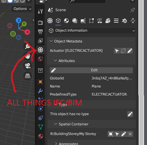
Note that prefixing all panels with "IFC" was also necessary to distinguish between Blender data and IFC data. Now that we are creating our own tab system (have you checked the latest developer builds in the past few days?) perhaps we can rethink this.
Now for something constructive, can you submit a bug so that we can track this issue? Here are some ideas:
-
Moving and renaming panels to remove the IFC prefix
-
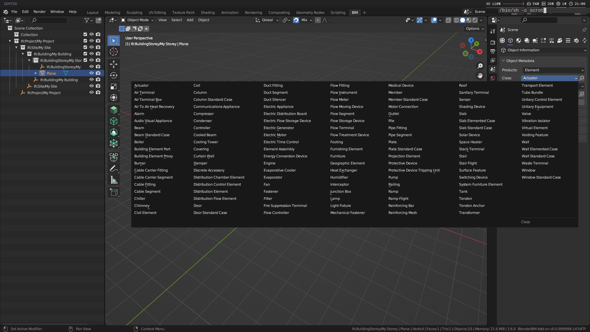
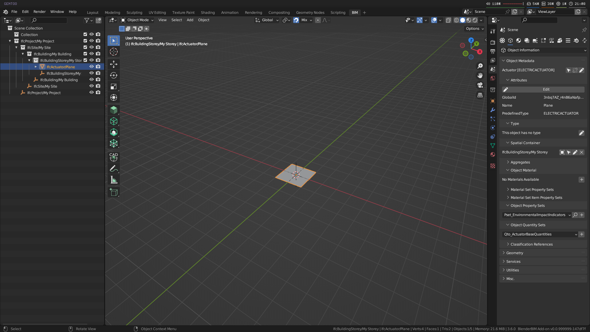
IFC class assignment removes the IFC prefix and separates into words e.g. "IfcBuildingStorey" becomes "Building Storey"
-
CapsCase attributes get separated e.g. "ObjectType" becomes "Object Type"
-
IFC Type class is not necessary for IFC4. Just show the name?
-
Potentially merge spatial containment and aggregate panel as it is all part of "decomposition"?
-
Name cleanup e.g. "IFC Object Property Sets" becomes "Property Sets"
Note that some things have significance e.g. "PsetWallCommon" is something I think you'd just have to learn. Anything with a Pset prefix is a ISO standardised property set and renaming it in any way will be harmful to users who have contractual requirements to use specifically named psets.
I'd love to hear other opinions too. Maybe they feel strongly the other way, that the IFC jargon should be exposed as much as possible?