F
by fbpyr on 19 Apr 2021
#
+1 votes
@Jesusbill I agree, it quickly sounds/looks like one thing.
Leaving out the addon names seems better for readability.
"BlenderBIM AddOns in Production" sounds fine to me.
If we wanted to make it real short we could do something like:
"BlenderBIM: voids & bridges"
Although that might be misleading, folks thinking it would be
actual about bridges. (-;
J
by Jesusbill on 19 Apr 2021
#
+3 votes
"BlenderBIM AddOns in Production" is the final answer. It's short, simple, accurate and creates also a curiosity to read more details if interested.
@gokermu that's the final answer that I believe in terms of size suits much better also the thumbnail.
D
by duncan on 19 Apr 2021
#
+1 votes
wuhoo! final decision! nice discussion with some interesting thoughts thrown around (mostly in chat if anyone wants to swim through them - we had fun).
G
by gokermu on 22 Apr 2021
#
+3 votes
"BlenderBIM Addons in Production" thumbnail is attached. Any idea is welcomed.

J
by Jesusbill on 22 Apr 2021, edited 22 Apr 2021
#
Looks great to me. Two comments, let's make it "Add-ons" and #14
Also the logo should be red? Not sure about it, others may have a stronger opinion
G
by gokermu on 22 Apr 2021, edited 22 Apr 2021
#
hey @Jesusbill
where can i find the following icon?:
J
by Jesusbill on 22 Apr 2021
#
@gokermu here but I meant the one with the red curve and not the one you show that is the red background with the transparent curve.
G
by gokermu on 22 Apr 2021
#
+4 votes
i got it, but i thought it would be better to try the one with solid background. anyway, the changes you recommended has been applied.

J
by Jesusbill on 23 Apr 2021
#
Thanks @gokermu feel free to provide any variation you may feel would be better
D
by duncan on 23 Apr 2021, edited 23 Apr 2021
#
+1 votes
Lets not start making a white on dark variation of the logo ... I agree that this looks fine red on dark. @gokermu the icon @Jesusbill showed is our favicon, so that button was just a picture of his browser tab. It's such a luxury having someone who makes sure we have a good logo each month - good work @gokermu
J
by Jesusbill on 23 Apr 2021
#
+2 votes
the icon @Jesusbill showed is our favicon, so that button was just a picture of his browser tab
@duncan I just pointed him to the page of all icons, @gokermu showed the favicon.
I made sure he did not use that one in the first place because I had you in mind actually :) I know you would go nuts to see that "version" of the logo. But if he wants to experiment with a variation for evaluation purposes I think it's ok
P
by prochitecture on 27 Apr 2021
#
+4 votes
I was invited by @Moult to present the current state and ongoing development of the Blender-OSM addon. I did't see the date for the June's meeting. I can't attend the meeting on June, 5. But I can on June, 12 or on any Saturday in July.
J
by Jesusbill on 27 Apr 2021
#
Hi @prochitecture, sounds great! I think we can book the slot for a meetup on the 12 of June, no problem to move the meeting by one week.
I will contact you in the next couple of weeks, maybe we can have a short call to discuss the specifics. Thanks
J
by Jesusbill on 30 May 2021
#
+7 votes
Glad to inform that @prochitecture will be presenting "Blender-OSM Add-on: the current state and ongoing development" in the next monthly meetup that will be held on the 12th of June. I will be making the announcements in these days.
@gokermu can you prepare the image, please, if possible by the end of Tuesday?
For the title in the image let's use "Blender-OSM Add-on" if the full title is too long. I remind you that this is meetup #15.

G
by gokermu on 31 May 2021
#
+3 votes
@Jesusbill said:
@gokermu can you prepare the image, please, if possible by the end of Tuesday?
For the title in the image let's use "Blender-OSM Add-on" if the full title is too long. I remind you that this is meetup #15.
Thumbnail is attached. I have used another image i found on blender-osm's github page. if you want me to change it with the image you shared, i can. I also used whole description you shared. any recommendation is welcomed!?

D
by duncan on 31 May 2021
#
@gokermu some strange white/red shadows around the logo&text. Maybe the thin peach colored vertical line distracts from the text readability.
J
by Jesusbill on 1 Jun 2021
#
@gokermu looks great, thanks! This image looks nice, no problem to use this.
J
by Jesusbill on 1 Jun 2021
#
@gokermu I agree with @duncan about the vertical line, looks a bit distracting. Not a deal breaker though
G
by gokermu on 1 Jun 2021
#
+4 votes
@duncan said:
@gokermu some strange white/red shadows around the logo&text. Maybe the thin peach colored vertical line distracts from the text readability.
Updated thumbnail is attached. 
J
by Jesusbill on 17 Jun 2021
#
+1 votes
Glad to announce that in the upcoming meetup that will be held on the 3rd of July we will host Lindsay Kay, the main developer of Xeokit, who will talk about this open-source web programming toolkit for AEC graphics. Announcements to follow next week.
@gokermu the site is this: https://xeokit.io/index.html
Do you want to work on your own for the thumbnail? I didn't ask one from the presented yet, as I saw that you do your own research on the topic :) Of course, if you think it is easier I can ask for an image, just let me know.
For the title let's use: xeokit: 3D Web Programming Toolkit for AEC Graphics
** If the title is too long I would eliminate the word programming
G
by gokermu on 17 Jun 2021
#
+1 votes
@Jesusbill said:
Glad to announce that in the upcoming meetup that will be held on the 3rd of July we will host Lindsay Kay, the main developer of Xeokit, who will talk about this open-source web programming toolkit for AEC graphics. Announcements to follow next week.
@gokermu the site is this: https://xeokit.io/index.html
Do you want to work on your own for the thumbnail? I didn't ask one from the presented yet, as I saw that you do your own research on the topic :) Of course, if you think it is easier I can ask for an image, just let me know.
For the title let's use: xeokit: 3D Web Programming Toolkit for AEC Graphics
** If the title is too long I would eliminate the word programming
I will find the image i think. :) I'll share it when i get a chance.
J
by Jesusbill on 17 Jun 2021
#
@gokermu I think so too :) thanks
G
by gokermu on 18 Jun 2021, edited 18 Jun 2021
#
+3 votes
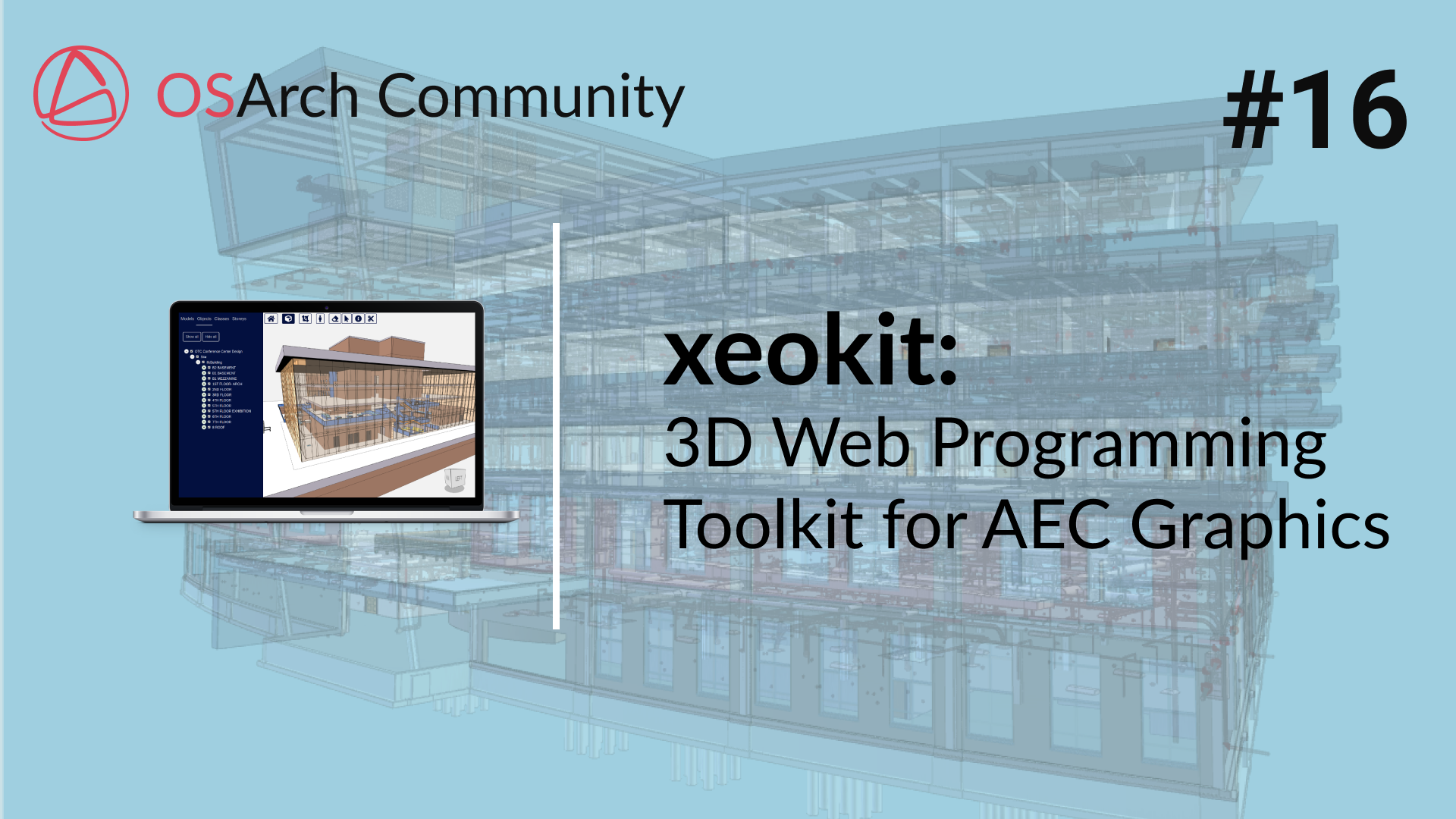
meetup #16 thumbnail is here! open for discussion.

D
by duncan on 18 Jun 2021
#
@Jesusbill we talked about adding the time and date in the corner of the graphics. How do you feel about that now?
