I've pulled/plagiarized/copied some text from one of @Moult discussions topics away from the OSArch Website Design thread to give it more space here.
The idea is that we would benefit from standardising the "look and feel" of the Wiki, Community, and OSArch landing page. There are three aspects to this:
-
A logo, repeated across all three sites
-
A colourscheme, repeated across all three sites.
-
A typeface, repeated across all three sites
@Moult current fonts: Open Sans for all headers, and Lato for all body text
We also need this consistent style for other things:
-
Teaching content with fliers, slides, videos etc.
-
Social media content
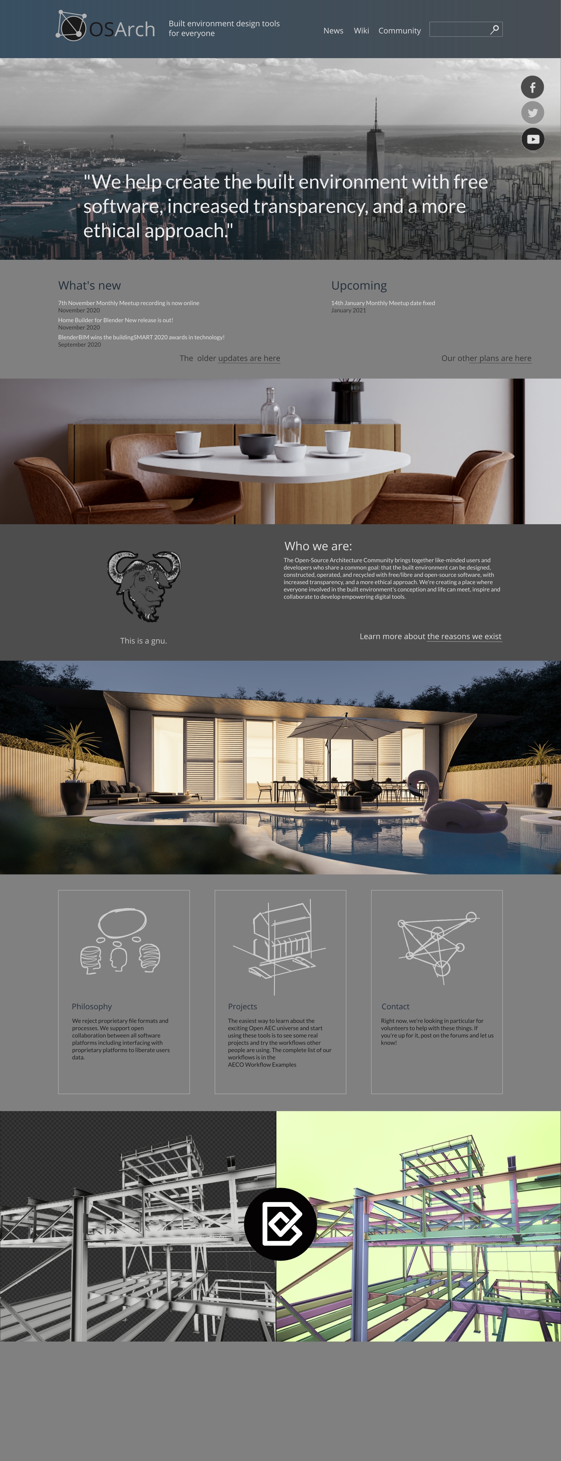
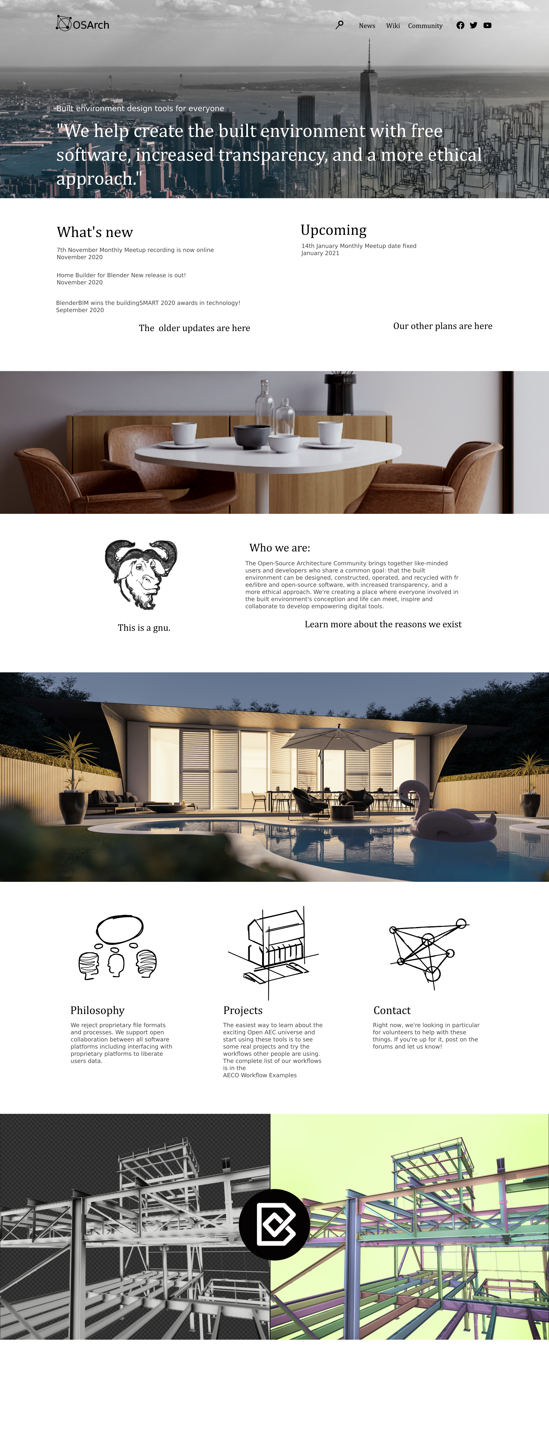
A color scheme should standardise background colours, text colours, link colours, button colours, across all pages. Doing this step is relatively easy and can do a lot for unification of the design. Do we want to continue with a light colour scheme, or do we want to swap to a dark theme?
Here is the community's current scheme: https://coolors.co/ffffff-22252c-e14658-555555-888384
Here is the wiki's current scheme: https://coolors.co/ffffff-555555-eaecf0-3366cc-8e36ae
Things to consider:
Links are extremely important in a Wiki. They should be clearly identifiable, with three distinct colours for regular links, visited links, and non-existant page links.
Pages may have lots of graphics, including screenshots of applications. How does this work with the colour scheme?
( @JanF this is the place for your logo ideas! )