Some thoughts and replies:
Colours
I was referring to the first post on this thread where a colour scheme was put forth. The new colour scheme also looks very promising. Before exploring more options for those I wanted to check if there are there any guidelines on what basis the schemes are determined/preferred?
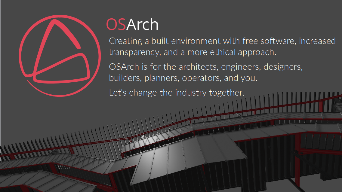
Logo
Logo seems to have been decided on this thread by vote. I think @gokermu is right in suggesting we fix the logo first before picking a color scheme. In some cases I've also worked with logos which don't have a fixed colour scheme but designed to be flexible to be adapted in different ways. I don't suppose we are trying to do something like that here.
Font
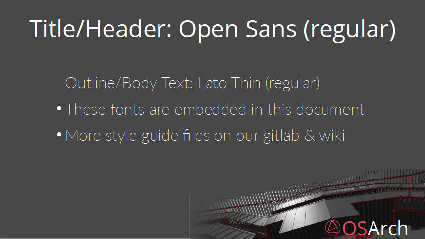
I agree on the apparent dissonance with font sizing. Thanks for pointing that out. I'll rework that. I read Lato and Open Sans being picked as the final fonts for the typography scheme. Please let me know if that is final or that is also being considered to be changed.
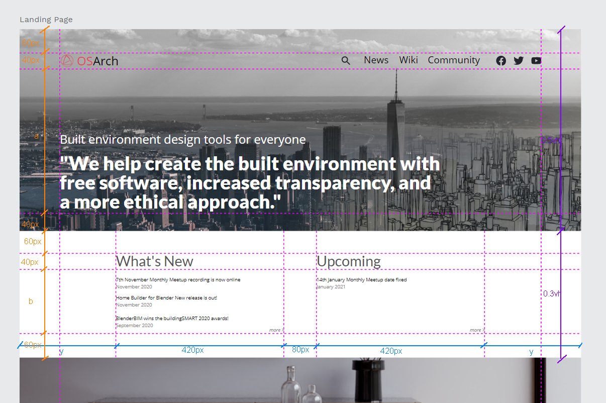
Grids and Alignment for Main Page
These were the gridlines and offsets/buffers I was trying to align to. The letters are indicative for responsive sizing.
The alignment guides line up to the containers which hold text instead of the text themselves. (I believe for things like "What's New" and "Upcoming" the text would be dynamic which won't be suitable for alignment anchors).
For offsets and sizing I was trying to be in multiples of 20px depending on the size of the content it is used around.
Hopefully rules/guidelines like these would be reusable across templates and formats for other media as well (slides, flyers etc.)
Text and linebreaks
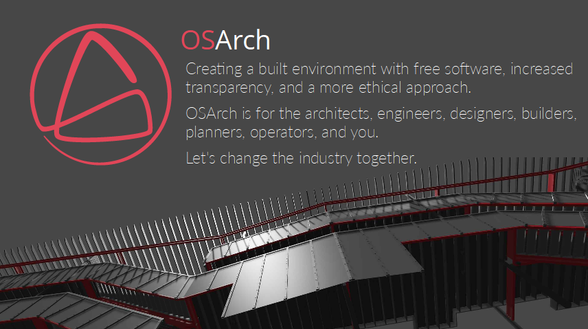
With text I believe it's important to have an idea of maximum number of words in a line. This depends on the font size and spacing around, but loosely speaking with large sized text (like the tagline above) it's good around to have a maximum of 6-10 words and physical width of 6-8".
With more dense paragraph like text it's good with max of 10-15 words in a line and 3-4" wide.
There are outliers for this, but few enough that they can be considered special cases. It might break symmetry at some places, but that is what we get for LTR writing systems I guess. Would like to hear your thoughts.
@JanF
Here's the page with sizes and styles. Same as the one above for Typography. Is that what you meant?
Assets are the repeated graphic elements we might use. (eg: icons for social media, directional arrows, menu icons, icons for arch software like Revit or Rhino or something, any custom icon we design etc.) Main purpose is to avoid having to lookup which icons or assets to use when creating new content based on this system. Also nice to use the same visual elements for consistency.
While we don't have to use all text styles on the website, if we are talking about a general design system I think it's worth it to have font-decoration (bolds, italics etc) be part of it. They might be usable in other contexts and if/when we use it there, it'd still be consistent with the overall visual identity.
Can you DM your email address and I can add you as a collaborator to be able to edit.
Thank you both for the comments and replies :) !
What do you think might be a good next step? I'm still getting familiar with things but much better than before.