Loving @bruno_perdigao logo (#K)
@JanF said:
I really like the yours @bruno_perdigao, but I couldn't help myself and made a sketchy one of that as well :D I feel like Moult has a point with the rough sketch styling being closer to the nature of OSArch. Btw. not sure what it was originally, but I see it as a tree in front of a building/mountain now.
Maybe the O in the sketchy version need to make some adjustment?
seems very close to airbnb logo.... (ó﹏ò。)
![]()
Also saw this the other day. Think it would be important to make it unique if we are to incorporate the open-source logo.
@chunchk said:
@JanF said:
I really like the yours @bruno_perdigao, but I couldn't help myself and made a sketchy one of that as well :D I feel like Moult has a point with the rough sketch styling being closer to the nature of OSArch. Btw. not sure what it was originally, but I see it as a tree in front of a building/mountain now.
Maybe the O in the sketchy version need to make some adjustment?
seems very close to airbnb logo.... (ó﹏ò。)
Damn, I kind of liked that one, heh. Thanks for the heads up.
I think it would be good not to incorporate the OSI logo, because technically what we support is free software - there are apparently some open source licenses that do not respect user freedom.
Added a variation of the option J, by @JanF . I played a little with grease pencil modifiers.
Added a MUSE for inspiration...
I have a number of reasons to avoid references to the OSI logo. Most importantly as @Moult notes not all OSI licenses are regarded by FSF as free software. I don't want to sidetrack this discussion to talk about licenses, so I'll post more on this in a different thread.
On a separate note we need to also keep in mind that we want a logo that is not only appealing and relatable for an architect, but also for a building maintenance supervisor and a back-room number crunching computational engineer. For me this means it shouldn't be too sketchy.
As I understand it the sketchiness of the logo would be a symbol of the community foundation of this organisation more than an appeal to architects.
Took a stab at one as well. Added to the FD.
https://dev.first-draft.xyz/d/K0ahv7t06h/?l=1642&t=1419&r=3326&b=2213&z=1.1
Here's the blender file, if anyone wants to play around
https://www.dropbox.com/s/yvwy0k9xl25alos/osa%20logo.blend?dl=1
I made a countdown to our two-weeks-since-the-last-post deadline.
@JanF said:
I made a countdown to our two-weeks-since-the-last-post deadline.
This should go in the right column of the main osarch page.
Hi all,
I am a newbie this forum and I'm really happy to be part of the OSArch community. I have just added my idea, based on theroyshaw work's. I played a little with the letters "O" and "S" of the Open-Source term.
I hope you like it.
Cheers.
So @three_d just sneaked a new proposal in two hours before the deadline, shell we restart it as originally planned or should we close it now?
I'd prefer to close it and start the vote so it doesn't drag on.
@three_d good job with 2 hours to go! :D
Maybe extend by a week? Simply because it was so last minute.
Ok reset the clock to a week from the last submission.
@JanF said:
So @three_d just sneaked a new proposal in two hours before the deadline, shell we restart it as originally planned or should we close it now?
I'd prefer to close it and start the vote so it doesn't drag on.
I'm sorry for the misunderstanding (my English is not very good).
When I saw the countdown I thought the deadline ultimate.
Unfortunately, I had not understood that if someone adds an idea before the deadline, the countdown restart from scratch :(
Hahaha no worries, it's great that you contributed, it was just a joke.
The vote for the new OSArch logo is finally up:
https://framadate.org/vCv3N1fhaHtG8FwI
I grouped the ones I saw as variants under one option - this is the first round, where we pick a few options which will get refined. I suggest the top four (one third) are taken to the next round.
I also excluded one of my proposals because of the similarity to the airbnb logo.
Voted ... for way too many of them. I think the top four going forward is a good idea and I think the grouping is good. Good work! Is there a way to include some numbers to make it easy to discuss them here?
One thing we didn't do is check them at several different sizes. Please think about that as you vote "will I recognize this at 16x16 pixels". We should do that for the next round.
If there is I haven't found it, I numbered their alt tags (1-12 going left to right), but these are not normally visible. (you can see those in the source code of the webpage, or if you disable your images)
@JanF what's the next stage and when does the first round of voting stop? It looks to me like 6, 8 & 9 should go further. Nothing else has more than four votes.
How about voting closes on the 7th of Jan (i.e. that makes 2 weeks of voting)?
Well I was hoping for more votes, but we can close it on the 7th and talk about the next stage at the meetup.
Behold the results of the first round:
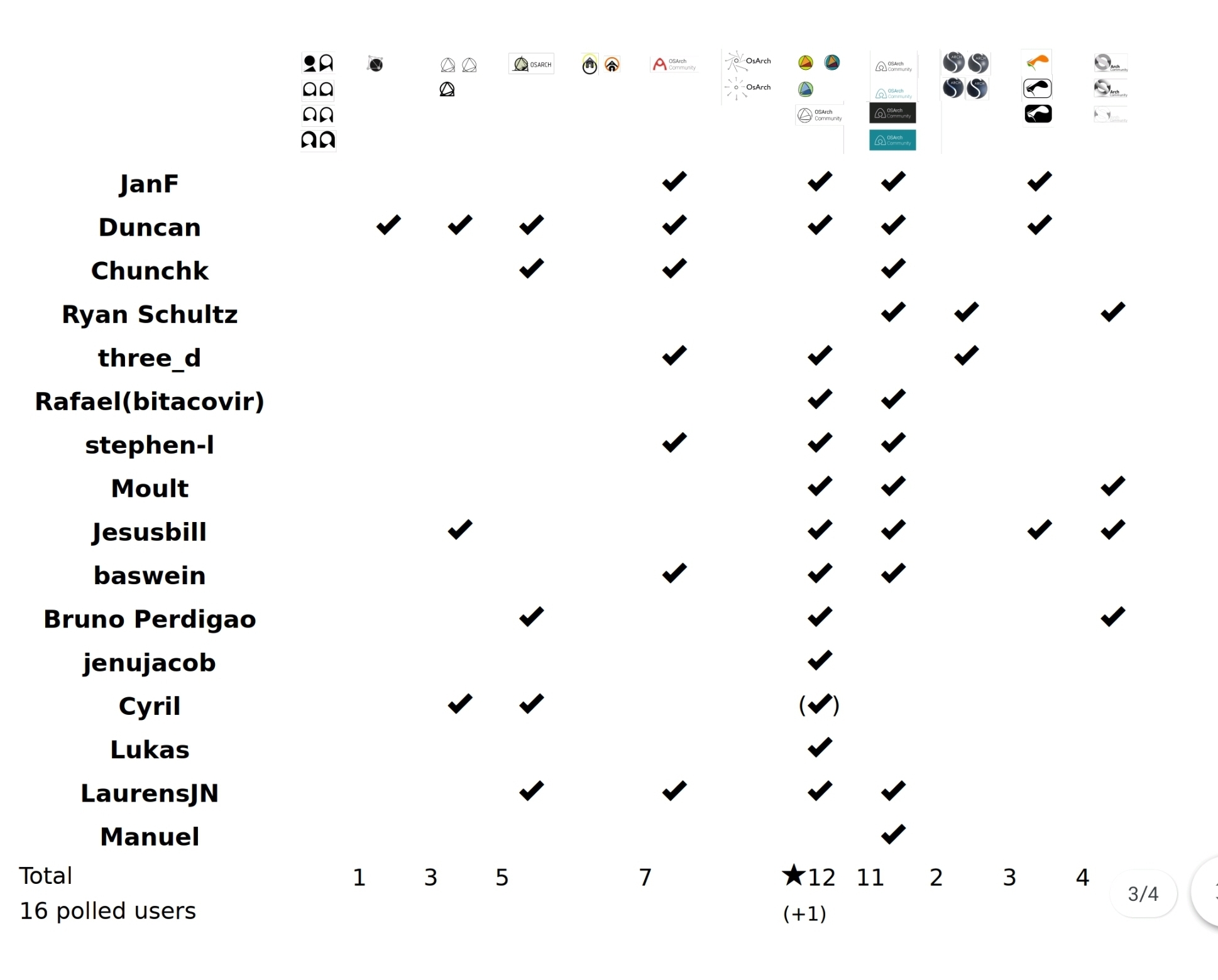
The best four are #4 #6 #8 #9. Let's discuss what do we do next tomorrow.