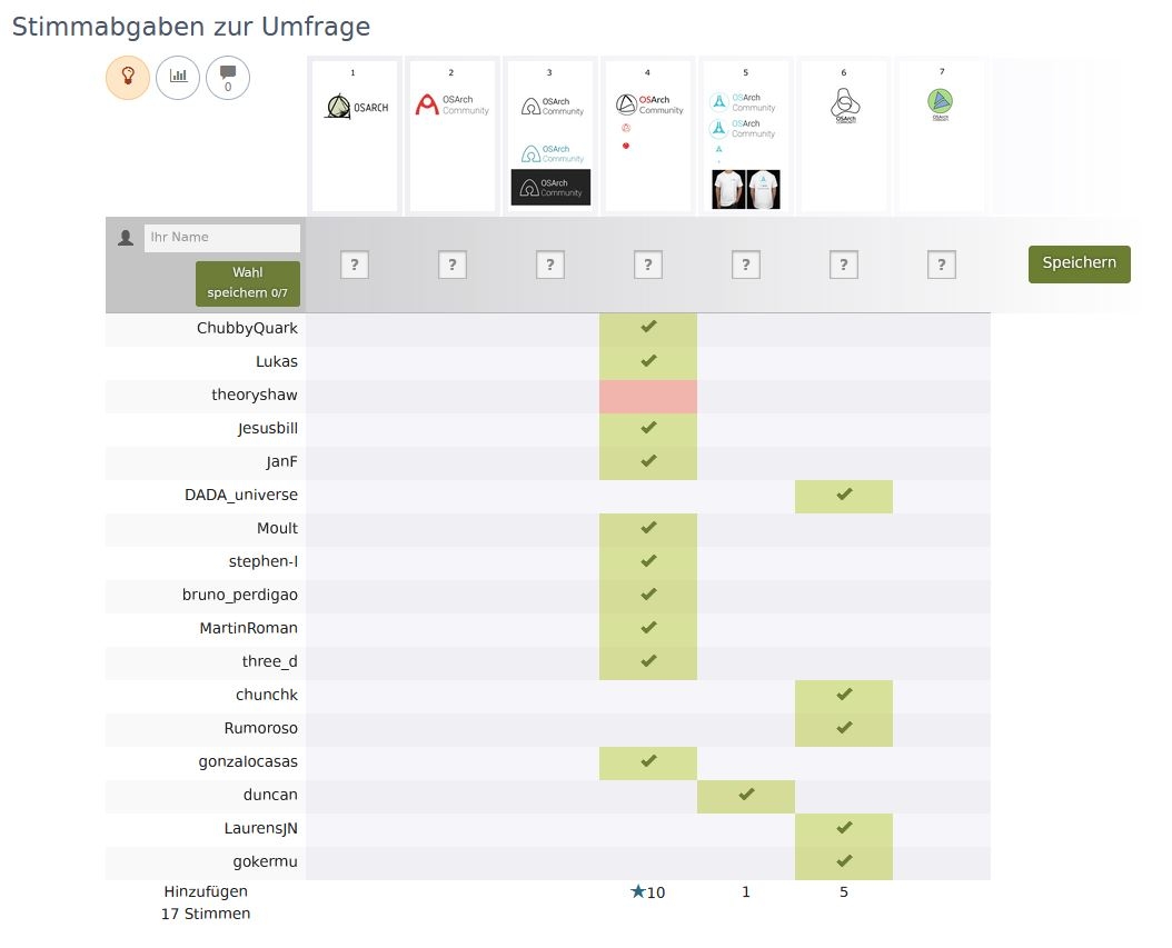
@lukas you marked only one as "no". That is completely fine, however, we will only count positive votes, so please add also a "yes" one somewhere.
@chunchk is that you who voted as Chun? Your vote will not be considered if you vote for more than one proposal.
@JanF there seems to be some malfunctioning of the website. At first it was offering only the "X' option for each case. I somehow managed to cast my vote with no selection and when trying to modify it (I can then see all four options) it does not save my updated vote.
In any case I vote for #4.
@Jesusbill sorry about that, I think a set the poll up wrong. I corrected it and your vote as well.
@lukas @theoryshaw can you please confirm your vote?
I did a mistake, and was not able to correct it..:-( , it was meant to be a 'yes'
I reckon we need a tie-breaker ;)
@JanF said:
@chunchk is that you who voted as Chun? Your vote will not be considered if you vote for more than one proposal.
Oh 1 only? sorry I didn't see it
Please ignore the the Votes from Chun. I will vote again under the name of chunchk
I nearly went with the flow but I really like the 'pen nib / futurist' logo so I chose honesty over conformity. But it looks like we're heading for a clear winner - that great!
Ok the poll is closed, we have a winner!
I've added the a section about our identity to the Wiki:
https://wiki.osarch.org/index.php?title=Open-Source_Architecture_Community#Identity
very cool. nice work.
Looks awesome. Could you share the editable version of the logo? So i can add it to our YouTube channel.
Added the svg to the wiki
https://wiki.osarch.org/index.php?title=File:OSArch_logo.svg
@JanF said:
Ok the poll is closed, we have a winner!
I've added the a section about our identity to the Wiki:
https://wiki.osarch.org/index.php?title=Open-Source_Architecture_Community#Identity
You should change the GNU and OS initiative logos in the title.
@bitacovir better for now?
@tetov could you give a shot at adding a favicon to all the OSArch sites (excl. learn.osarch as @SigmaDimensions can tackle that)? I assume it'll be based off the 64px version.
@Moult Favicon and Apple's touch-icon scheme set for all pages now.
@SigmaDimensions: The multi-resolution favicon file can be found here.
I feel that we didn't really take seriously the ide that we choose a design and the colorscheme would follow. We now have three design red+white, white+red & black+white.
I suggest we immediately drop the black on white. The red works so well and looks really sharp, even on a dark background. It was a good choice with that not-very-dark red.
Here is how it looks a few places:
-
https://fosstodon.org/web/accounts/331798 (yes, this is new)
PS. Could someone please make a red on white round version? The square one doesn't work so well on LinkedIn.
I second dropping the black on white one.
As for the PS, the logo is round? Not following.
@tetov it might be something with the way LinkedIn for companies works. It's given the logo a square background rather than a round one. I'm guessing that's to give the company more control. Might work differently if the background was round and not transparent - haven't got time to check.
I think the same format would work better for the favicon as well. The white circle with a red swirl is very distinct.
You mean that you want the logo on top of a white circle and the rest transparent?
I don’t think it will make any difference for linkedin since they seem to make transparent regions white.
Any hint from the maker? I have no idea

@Jesusbill said:
Any hint from the maker? I have no idea
It's supposed to be a symbol of the community foundation.
Is it maybe possible to have a slightly different icon for the forum and for the wiki? Like the reverse colour combination for one of them? I noticed only now that they were different before (right?), because I often have multiple tabs open (wiki + forum) and suddenly now it's a bit harder to see which tab is which. What do others think about that?
Anyway I think the logo is really awesome :)
@duncan said:
- https://fosstodon.org/web/accounts/331798 (yes, this is new)
Be careful with the red+black one. It is a bit revolutionary style XD
@LaurensJN said:
What do others think about that?
I think the idea is interesting and I have the same problem. But I don't think we should open a new can of worms just yet. I suggest we choose from what we have. I have the same problem now - but there's not many of us in this world with that problem. I think building a recognizable logo is more important than this annoyance.
@bitacovir I was wondering if I was the only one who saw that. It's fixed now (even though it did look cool). I've added a file with a fixed white background to the file set.
https://wiki.osarch.org/index.php?title=Open-Source_Architecture_Community#Identity